
Pattern Matching & Color Combinations in Our Kantha Blankets

Recently, dignify received a review on our blankets that addressed the variety of our styles (color/pattern), and the contrast/matching choices that go into our kantha. Let's take a glimpse behind-the-scenes at the number of factors that contribute to these decisions.
How do we choose the fabric? How do we match saris to create the kantha blankets? Why are some combinations bad? Why aren’t there more grey/buttery yellow/navy blue color combos?
I know that many of you have wondered about these questions from time to time, too!
Here is the blanket review:
Hello,
I love the excellent quality of the throws, I already bought a few. However, the combination of patterns could be better. The color match could be more tasteful. Also, in the advertising pictures there are some prettier than the available ones.
…I would love to see the white background with flowers a little brighter and more tasteful contrast. Sometimes one side is pretty but the other side is not good at all.
I will keep looking and hopefully prettier ones are available.
Zing! Maria affirmed the high standards of quality of dignify's classic throws; and, she brought up some disappointments that I understand. Let's dig in.
A Commitment to Repurposed Saris Has Its Drawbacks…
The building blocks of our kantha products are really very simple: repurposed, everyday cotton saris (or specialty silk-blend saris), and thread. This reflects the traditional craft of kantha (meaning "patched cloth"), and also highlights the talent of the artisans in the skilled stitching.
We like the environmental win of repurposing cloth, rather than adding to the massive climate cost of producing new textiles. Collecting these raw materials also creates the truly unique, one-of-a-kind pieces that stand out in an era of mass production.
But, there are downsides (or, perhaps better stated, challenges), too:
-
The patterns featured on printed saris are dictated by Bengali tastes, not by Western design.
There is a lot of overlap in what our different cultures consider beautiful, but not entirely! This is the dance of Western-eye-appeal with integrity of a craft in its historical/cultural tradition.
-
Bengali aesthetic is not... subtle
Vibrancy and rich, loud colors are trademarks of the culture! This is what we love about kantha (and also why we developed the simplicity kantha as an alternative.
-
Color trends & fads
Just like in America, there are trends that come and go. Maybe lime greens were on-trend last year, or purples. Subsequently, we would see a disproportionate increase in the sari cloth available in those colors.
-
Remember, saris are women's clothing!
Navy blue, greys, &, muted colors are uncommon. Floral patterns are extremely common. Picture a woman's dress — florals are much more likely to feature than check or geometrics.
-
The sizing of our blankets
Similarly, the size of our throws are determined by the standard size of saris — our raw working material.
We have (and do, continually) consider printing our own designs on new cloth — then, making these into kantha products. This option is less environmental, less unique, less soft, less interesting, and more costly than our current approach.
One opportunity we are considering is to work with Basha to print our own saris, sell them new to women in Bangladesh, and create a system where Basha will buy them back later on (to use to create kantha). This is a long-game vision, and an exciting potential! As dignify grows, this becomes more of a possibility.
But, this would still only capture a portion of the overall scale of saris we need to produce the blankets we sell.
Combinations & Color Matching
The colors and patterns that are featured within a single sari cloth are because of the reasons stated above. In some cases, the style/match is very much baffling to me! Different cultural eye! In other cases, the combination is more creative & stunning than I could have imagined.
Matching two saris together (for the two sides of a kantha blanket) is a different story altogether: it's a human job.
When dignify first began, all of the sari matching was done by one woman, an American. She had a great eye for combinations that would appeal to a Western eye, because, of course, that was her cultural background.
As Basha has grown in scale, this task became impossible for one person (who also had numerous other responsibilities). Not to mention that we actually want the staff to be empowered in all roles of the business.
Here are some challenges we've encountered.
-
Color trends. As I mentioned above, there may be a sweeping color trend, like purple. Purple becomes so pervasive, that it is impossible to only match with other purples!
Many other colored saris will have a hint of purple, a few purple flowers, a purple highlight here & there. It makes it tricky to have matches that completely exclude purple. Then, it feels like dignify simply has a lot of purple blankets! (no offense, purple: you're just an example 😉)
-
Different cultural eyes for what is a tasteful match. We were confused by some of the matches for a while, until we discovered that they were matching many based on the shape of the pattern, over the color.
This is just one example of the difficulty in communicating nuanced preferences, in a task that is completely subjective, across the world, in opposite time zones and different native languages.
- Communication. Furthermore, how do we effectively communicate what is "good" and what is "not good"? Here was a large throw from our very first collection. It sold quickly and it was attractive because of the deep, warm colors and simple, minimal pattern.

- I followed up with Basha that we really loved the blanket and would love more like it. It took me longer than it should have to understand why we were receiving so many wild orange-and-purple combos! (none of which captured the very unique combination of rich homeyness that this one did!)
We try to create lookbooks and standards together so that the job of sari matching is not limited to only one staff member. But, it is difficult to articulate exactly what are the elements in a blanket that make it desirable.
Robin has helpfully pointed out to me that in 2012, my entire collection was 60 blankets. Now, dignify's shipments include 600, 700 pieces... never less than 150. The truth is, we still get those eye-popping gems; and, we get a lot more.
Besides, beauty is in the eye of the beholder! I've written before that often the blankets I dislike are beloved by others. So, what do I know?

Our color combinations & pattern matching in saris (for the ultimate goal of creating beautiful kantha blankets), is all art, no science. If you think you can lend your skills to doing a better job, we will be thrilled to send you to Dhaka! :)
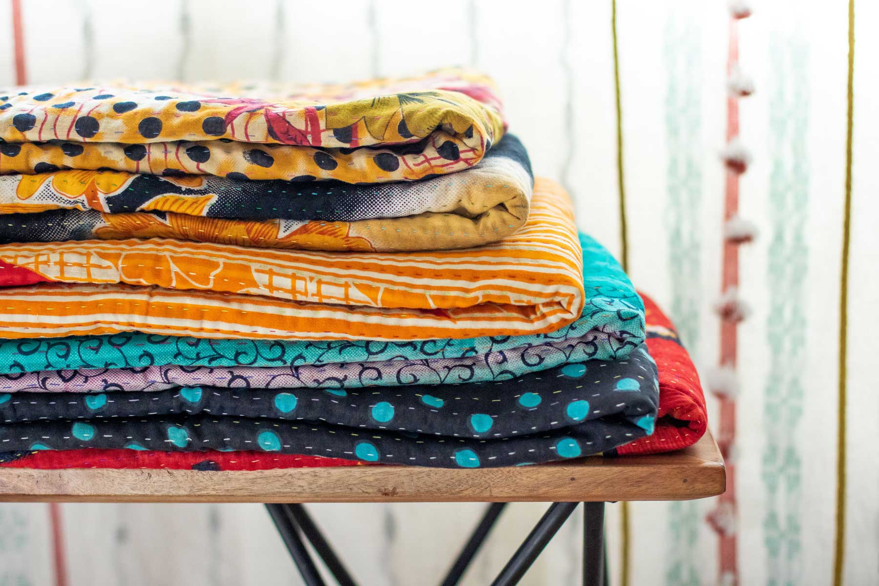
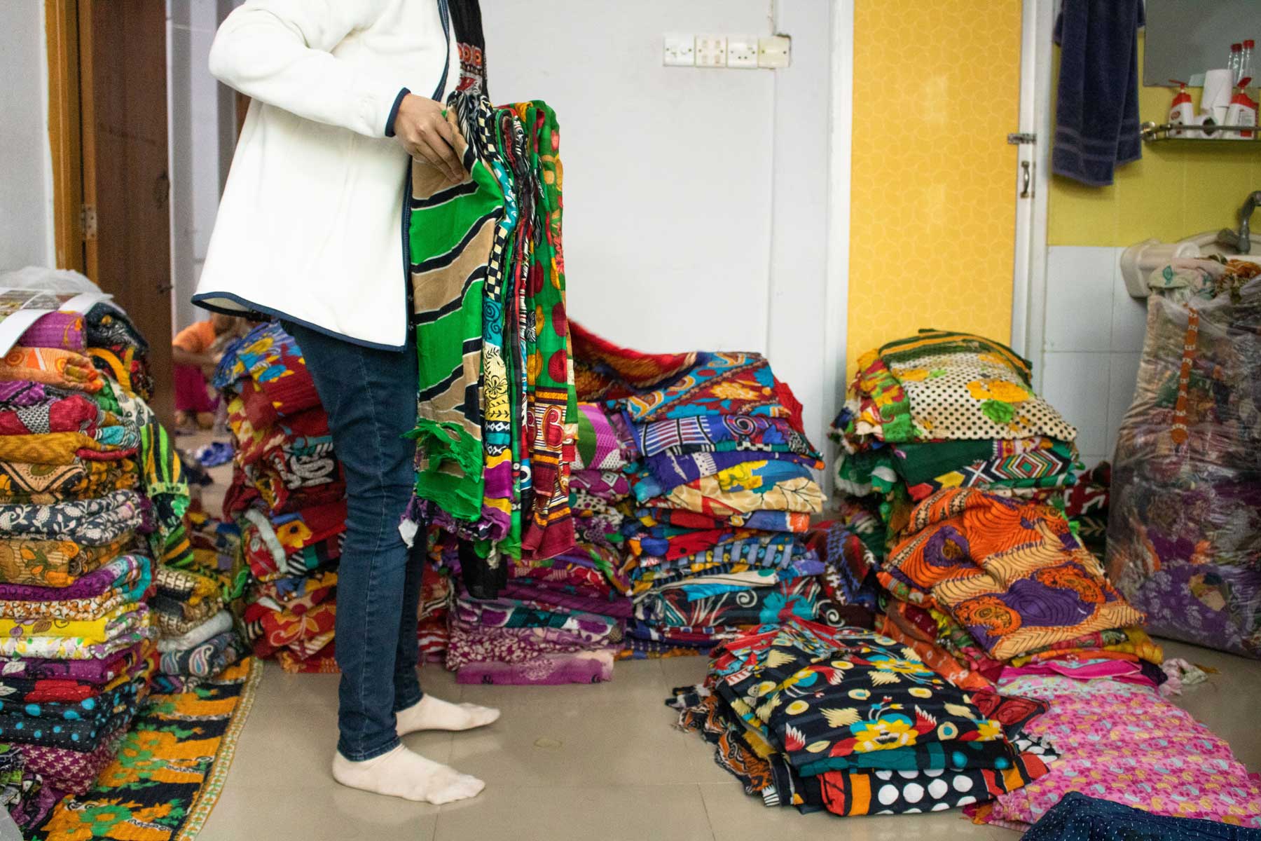
These photos are from my trip to Bangladesh in January 2020. The team wanted me to participate in sari matching so that I would see how challenging it is in reality.
In these photos, you can spot the textiles separated by color: red, purple, blue, green, yellow/orange, pink, black. And, you can spot what a farce it is to think that we can truly categorize them by color!
Our kantha journey is wild, vibrant, challenging, and fun. That's why so many people love their blankets! We hope that you can find one to love, too.